Friday, 27 March 2015

Evaluation Activity 4

"How did you use media technologies in the construction and research, planning and evaluation stages?"

Throughout the completion of the coursework tasks I have used a variety of media technologies in both my construction, research and planning and evaluation stages of the coursework. I believe that in all of the aforementioned areas the use of these technologies to aid me has been both beneficial to my work and helped in the economy process of completing the work, as well as aiding my work to look more professional. Naturally, in the technologically advanced world of the 21st century and with their ever more consistent use in modern day society, the use of computers played a large role in helping me to successfully complete my work. For example, the fact that the coursework has been uploaded directly onto a networked platform of a blog, which in turn can be classed as a social medium and platform in it's own right is merely one example of how technology has had an impact upon my work. It would be no shortage of the truth to say that without Digital Technology some of the executive creative decisions faced by Zach and myself throughout the process would not have proved possible without the existence of specialist software in aiding us to create our work and in turn fulfil our vision successfully. 


For example, within the early planning and research stages of this project I made use of video sharing website YouTube to look at and make note of existing examples of Social Realism film trailers and see how the Codes and Conventions had either been successfully applied or, alternatively, subverted for particular effect. For example, I found that Danny Boyle's film Trainspotting, being one of the originating and defining films of the genre was a film that matched very closely the typical Codes and Conventions of the genre that would be expected from an audience. I also used websites such as IMDb to collect and collate research on existing films and see how their marketing campaigns had influenced the films and discovered that increasingly film distributors are making advantageous use of Social Media by which to target their younger demographics, this did not particularly surprise me given the large increase and uptake in social media usage given the advent of Facebook in 2008 and similarly Twitter in 2010. I feel that were our film to be of full scale production we would more than likely use Social Media as just one element of our marketing campaign in conjunction with our trailer and our two Ancillary Tasks. 


Similarly, during the planning stages of the project I used internet mindmap planning software/ website "ExamTime" which enabled me to lay out my thought processes effectively, clearly and coherently in a digital format.  Use of the internet in general as a digital technology proved effective to me as I was able to view existing examples of posters and film magazine covers for my ancillary tasks and implement into my own work features that I found inspiring, or wished to replicate, such as ensuring that the protagonist of the film was clearly and easily the main focus of the film's promotional poster. Through the use of digital technology I was able to upload handwritten drafted work effectively as a photo into blog posts and integrate these handwritten/drawn elements into the work that had been created purely digitally such as my storyboard.

It was largely in the construction area of the project I feel that we made best use of digital technology as it was within this section of the project that we made use of a video camera to record our footage  for our film trailer. This technology, although proving temperamental at times, was of great beneficence to us, as it was through the clear and focussed film quality that we were accurately able to capture the performance our actors were giving. It was in the editing of our work that I got to grips with Imovie of which we had used previously for our AS Foundation Portfolio. As I was experienced in using this technology I felt confident in my ability to navigate the software and co- edit the work with Zach in a collaborative team effort. In the creation of the two Ancillary texts of a film poster and magazine cover, I experienced my virginal experience with photo manipulation software in the form of Adobe Photoshop. Given it's precise nature, this reared up a few difficulties in learning how to use the Software effectively in a short space of time given the precise technicalities associated with the software such as how to overlay text onto images effectively and most importantly learning of the necessity and importance of creating new layers for every new element of a photograph that  you wish to manipulate as at one stage I almost lost work due to not having completed this vital  task. Not creating layers on my Photoshop image meant that every change I had made was onto the original image itself which, with the benefit of hindsight was not the correct thing to do by any means as this left my work vulnerable and prone to deletion with relative ease had a mistake been made in the photo editing process.       

Throughout the course of the Evaluation process of the project the use of Digital Technology has allowed us to reflect effectively on our work and with a critical eye. Indeed one of the best examples available to me is the director's commentary style video Zach and I created detailing the processes involved at various stages of our coursework journey on how we completed our coursework with particular attention being paid to the Construction aspect of the work. 

In conclusion, without a doubt Digital Technology has proven to be advantageous to both me and Zach when creating our coursework as without it our work would be by no means as effective and hard hitting as it otherwise would have been without it. In the absence of Digital Technology we would have been  consigned to merely planning the tasks, which in the absence of the available Digital Technology, would have been far less pleasurable and certainly by and large, far less rewarding upon completion.             

Thursday, 26 March 2015

Evaluation Activity 3

"What have you learned from your Audience Feedback?"


Here is listed the 11 questions we used in our audience feedback survey:
Q1: Are you Male or Female?
Q2: Age?
Q3: Is the storyline compelling and exciting to you as a viewer how could it be improved?

This chart effectively shows that more viewers from our target audience found our storyline compelling and exciting, which is the result we were hoping to achieve as this informed us that we had gauged our target audience effectively and correctly.


Q4: Have you seen any films or trailers that are stylistically similar? If so, what are they?


This chart again shows that we were correct in targeting our film toward that of an older audience as they better understood the genre that we were hoping to replicate as many members of the audience within the higher audience range bracket had seen films of the Social Realism genre previously whereas as our graph dictates those of a younger audience were not fully aware of the genre and it's true meaning.

Q5: What genre do you feel our trailer conforms to? Please tick one or more
Q6: Do you feel the music of the trailer applies to the genre above? If not why?
Q7:  Do the Film Poster and Magazine Cover share similarities? If so what?
Q8: Did the editing feel jumpy at stages?
 Q9:   Do you feel this trailer represents real life situations?


I was pleased with this result as this showed that most students across all of the age brackets were able to correlate our work and relate it to real life situations, indicating that our trailer was realistic and relevant to real life situations.
Q10: Do you have any extra comments on the trailer, poster or magazine trailer?
Q11: After seeing the trailer would you be tempted to go see the film? If so why?

As part of the evaluation process we decided to screen our work to adolescents of varying ages, as test audiences and gather feedback from them after having seen our work, we felt that this was important for us as it would allow us to gauge whether we had set our target demographic appropriately and accordingly. We screened our work to groups of three age categories. asking a total of 11 males between the ages of 14 to 18
8 Females between 14 and 18
(14 being under target audience age) 

 The first set of adolescents that we showed our work to were a male and female audience between the ages of 14 and 15 years old. These were Year 10 students. Our second screening was shown to Year 10 students between the ages of 15 and 16 years of age and GCSE, Year 11 students.  Our third screening was shown to students in the Lower 6th Form, Year 12 students, between the ages of 16 and 17. To begin with, we were solemnly disheartened with the first results that we received from our audience feedback. These results were collected from the Year 10 students and we were largely slated in this set of feedback results with students commenting, bemoaning, the fact that they: "Didn't really understand the storyline" and they didn't "want to watch a film about smoking", it was comments such as this that led to us becoming largely irritated and thinking that at one point we had totally misjudged the required needs that audiences of an adolescent demographic were looking to be fulfilled when viewing our work. The second set of results that we received  were from Year 11 students and did not improve our feelings and we were left in a greater sense of annoyance at the fact that we had misjudged and misinterpreted the Codes and Conventions of not only the genre (as only a few people were able to identify our work as a Social Realism) but also the pace and music choice used in the trailer as similarly students were commenting on the fact that our music choice was not appropriate for the accompanying footage shown on the screen. Many students within the second screening commented that the music used in the trailer was too reminiscent of music from an action film trailer and as such, they felt the soundtrack and footage did not complement each other effectively given the genre of our film. The heightened emotion and tension created by this music resulted in a non correlation of expected action by the viewer, from the footage on the screen leaving some audience members confused as to the plotline and the story of our piece.
I was pleased with the fact that nearly all of the students were able to see a consistency within my Ancillary Texts to that of my main trailer, this is a fact that pleased me as this confirmed that my style consistency had been well informed and the target audience were able to see the correlation between all three pieces of work.

However, despite our negative experiences of showing our work to Year 10 and Year 11 students, it came largely with relief and an enormous sense of surprise that upon our final screening to Media Studies students in Year 12  that they understood the storyline of the piece  and our creative decisions that we had elected to take such as our music choices for example. These results largely impressed both me and Zach as we realised that we had decided upon our target demographic of 17- 20 year old adolescents with particular accuracy. It was with this age category that our work proved to be the most popular and successful; a fact with which we were very pleased and impressed with. This also showed that, with our film proving unpopular with a younger audience than that with which we were aiming for we had gauged our target audience effectively and correctly in terms of content and level of maturity. The majority of people were of the view that the film trailer and the two ancillary texts produced in conjunction with it, shared recognisable consistencies between all of the three products, which again I was extremely pleased and relieved with.


In conclusion, I was impressed with how our audience feedback went as it affirmed that we had chosen our target demographic correctly. Upon reflection, were we to repeat the coursework, I would most likely have changed the music choice within the trailer as upon reflection it maybe was too dramatic for the mitigating circumstances within the trailer. The audience feedback provided us with useful information as to how audiences reacted to our work and what further improvements to make were we to repeat the task, having understood the feedback in a positive light, I am pleased that we undertook the task as it highlighted areas whereupon we can successfully improve our work in the future.    

Wednesday, 25 March 2015

Evaluation Activity 2

"How effective is the combination of  your main product and ancillary texts?"


We aimed for the three texts of the film trailer, the magazine cover and the film poster to share consistencies with one another such as colouring and font so that our film "Old Habits Die Hard" becomes a recognisable brand of it's own as it develops certain attributes that become associated with it. Throughout the three texts we aimed for their to be consistencies in the overall mood of the three pieces providing a dark and sinister mood to the film.


 For example, in our film trailer we were particularly keen to make advantageous use of darkness and exploit the use of a lack of lighting to subsequently create a dark mood. This use of darkness and secondary colours, colours such as  sharp, metallic greys and a grimmer use of lighting were used to create the embodiment of an environment on the underbelly of society. Throughout all three texts we were primarily concerning ourselves with how best to replicate social isolation, dependency and an urban environment having been starved of economic growth and investment, an environment in need of regeneration. Through the use of this stereotypically and decidedly urban environment we were hoping to replicate within our work the living conditions of working class members of society. A working class member of society is exactly who our central protagonist, Toby Scott, is a member of. As such, we are hoping the audience would better be able to understand his addiction to drugs as he is surrounded by depravity and social and economic upheaval, we were hoping to show that his addiction to drugs is seen as an understandable, but by no means excusable, release from his difficulties.  A working class urban environment, is a consistency we were hoping to effectively replicate across the range of the three promotional texts. I believe we have been able to fulfil our  desired aim as the setting for all three promotional texts bears a recognisable consistency with one another that I feel emphasises our film to great effect and marks our film out in a unique way.


As this is the case, our film was able to manifest an identity of it's own in a similar way to how existing Social Realism film example, This is England demonstrates effectively.   This was done through the showcasing  of an economically deprived area to highlight to the respective audience the genre of the film effectively and clearly. In the marketing campaign for This is England it too uses, in a similar way to how we also effectively applied a dark mood through effective lighting was used. The use of atmospheric, natural lighting is one of the consistencies shared by all of the products as being dark and ominous giving clear indications as to the dark, avaricious nature of events that will unfold in the production.

The two Ancillary Tasks of the magazine cover and my film poster share common consistencies of being united through the binary opposite colours of green and red in their styling. Not only do these colour consistencies act as an identity for the film but the use of the two colours, in a similar way to Toby's binary opposition with the antagonists of the piece, share directly opposing connotations with the Colour red implying danger and deceit whilst the colour green acts as a metaphor for positivity and a healthy wellbeing which is in direct opposition to what is showcased within  our main trailer with the central protagonist seen to be smoking consistently throughout the course of the trailer. We felt it was important for the two Ancillary Texts to share consistencies with one another so that they could be identified as part of the same promotional package, which I believe works very successfully.

I think that all of our products share a common consistency in that relatively little is revealed about the central protagonist. The character's dark clothing is used to compliment the lighting so his identity remains an intended secret. This is due to the fact that Toby could be "any man" essentially and as such we wanted to not mark him out as a specific individual or focal point particularly, as we were very keen on the idea that Toby should effectively be able to blend into everyday society and his surroundings. The reason for giving Toby a greater concealed identity is in reference to the idea that     anybody could effectively find themselves in Toby's position and fighting an addiction of their own. We felt that this approach therefore improve the chemistry between the viewer and the character despite on a superficial level seeming to distance the audience from an initially unknown character.

Evaluation Activity 1

"In what ways does your media project use, develop or challenge forms and conventions of real media products?"


I think that the products I have created consisting of my film trailer and subsequently my film magazine cover and promotional poster, conform to existing media products fairly well, as it was from existing products that I took my inspiration, initiative and ideas about what to include in my own products.


To ensure that we were clear as to which Codes and Conventions to stick to and those which we felt to ignore we studied the conventions in great detail and identified in Boyle's work where he had implemented  them effectively. First of all, we identified the Codes and Conventions of the genre, as shown below:
Location Shooting
Wide Shots- Wide Shots are important given their wide expanse and coverage. In short, they can cover a wide area in a shot with the camera remaining static. The wide shot allows viewers to feel slightly voyeuristic as in places, and if used effectively, it can seem as if the viewer is intruding into a private matter that it was unintended for them to witness.
Non- Professional Actors- Typically Social Realism films launch the careers of aspiring actors. These actors tend to be in need of an opportunity to showcase their talents on the platform of the film medium. Relatively cheap to make and with low production costs, it is the Social Realism genre that tends to allow new actors an opportunity to express their talent. As Social Realisms are generally fairly cheap to make there is little financial risk associated with bringing in an inexperienced actor to portray a character. In conjunction with this is the possibility that new talent requires a proving ground of sorts, not just to be recognised as a serious talent but in order for their skills to be honed appropriately by a director. Within our own film opening, we used amateur actors for the aforementioned reasoning. We found that through the professionalism and dedication of our actors, they contributed extremely positively to the successful outcome of our project. Similarly in Boyle's film, he hired unknown actors at the time of the production of  Trainspotting who, in the aftermath of starring in the production have subsequently gone on to further their acting careers into household names in more prominent, and arguably more established and lucrative genres such as the Action/ Adventure genre.

Semi- Improvised Scripts- Whilst being a convention of the genre and one which, in the early planning and research stages, we were looking to replicate within our own work, in the end we decided against conforming to the convention of a semi- improvised script, as whilst providing strong creative input from an actor into how a character might react in a given situation we felt it was more appropriate to use the carefully considered and pre prepared dialogue that was written on the script rather than planning before a scene what the dialogue would be as we felt ultimately it would prove to be unnatural and it would seem forced something that we were keen to avoid.
Humour and Seriousness- Given the dark nature of the piece we knew that in a feature length production we would contrast the dark moments of the script with lighter humour highlighted through the inclusion of dry humour and a strong sense of camaraderie from the central characters.
The erosion of regional identities
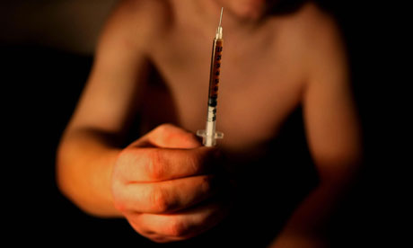
Wider social issues explored via emotional and dramatic individual stories- This was perhaps the Code and Convention that we  endured we stuck to the most. As our overarching plot is of an isolated male seeking redemption and the annulment of a crippling addiction the story, whilst focussing very much on the central protagonists throws up the wider issue of recreational drug use. We are confident that viewers will be able to see the unquestionable consequences of making such an ill fated decision in turning to the habit for pleasure and release, from the mundane norm of everyday reality.  

Further to this through our analysis of Boyle's work we uncovered that his use of camera angles were particularly effective. Of particular worthy mention is how I feel we replicated the POV shot from  "The Worst Toilet in Scotland" scene from Boyle's film and applied this technique to our own work as can be evidenced in the two clips below.
https://www.youtube.com/watch?v=7RoMaS1pzOE (2:16)

and that of our own trailer:
https://www.youtube.com/watch?v=ZxR5VxbK31Q (1:20)


 We felt it very important that all three of the products shared and maintained a dark and sinister look and mood about them as we knew that it was crucial the marketing had to reflect the overall feeling of the film in it's entirety were it to be publicly produced. For this reason the mood in all of the products was set to replicate a consistently dark and unnerving feeling, as both Zach and I concluded this would be the overall effect we wanted to immerse onto our viewers. This was due to the dark nature of the story and the central protagonist's ill remedied shortcomings as he battles to overcome his twisted addiction to drugs.


Being a film that would hopefully, ultimately fit into the Social Realism genre we felt it important that the audience would easily be able to connect with the character of Toby Scott on an emotional, subjective level. Although however, we did appreciate, and subsequently were mindful of, the fact that some audience members may perhaps find it both difficult and challenging to empathise with the character's situation owing and being very much dependent on the level of exposure they have experienced in the oppressive, often vicious cycle of recreational drug use.


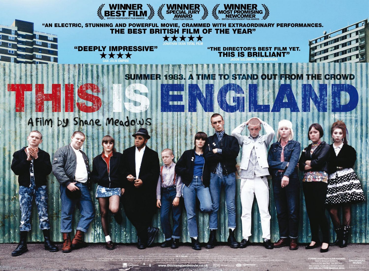
I believe that our film is very much reminiscent and echoes sentiments of existing films of the Social Realism genre. Indeed, we took the majority of our ideas and themes from Danny Boyle's classic film "Trainspotting", a widely attributable film title that champions the genre of Social Realism. With it's success very well known and documented, bearing little secret as to it's popularity through it's widely discussed nature, we knew this was a film that we had to look extremely carefully at in order to extract the best bits from and apply them systematically to our own work.  Indeed, in the trailer for Boyle's film, a dark, sinister, urban feeling is evoked, however, beneath the superficial bleakness and depravity that is portrayed, there remains between the protagonists in the trailer a kindred spirit and united bond of friendship, binding all of the characters together in a strong unity. This is highlighted in Boyle's work through the unveiling of the character's surnames in the trailer whilst the picture is frozen in a black and white background. Through implementing this into his work, Boyle is allowing his audience, through the short space and time constraints of a trailer to be able to begin to connect with the characters in his work. This is something that we ourselves were largely hoping to replicate within our own trailer. This is an aspect of Boyle's work that we were looking to replicate effectively in our own work. We were able to achieve this effectively through the introduction of the character of "Marty Smith" that appears in the trailer who acts as a companion to Toby throughout the course of our trailer. We decided to show the names of the characters upon the screen as opposed to actor billing as we knew stylistically the audience would not be expecting to see this within our trailer.
Also, by screening the characters names onto the screen, within the short time capacity of the trailer, the audience are already beginning to become accustomed to our characters and are beginning to get to know them.


Another aspect of our trailer that was modelled on Boyle's work was the interaction the viewer experiences with the central protagonist in the trailer. This is a tactic similarly deployed by Boyle in order for his audience to be able to connect to his characters to a greater extent. Lending from Trainspotting we thought it a good idea in our trailer to have our central protagonist share a greater intimacy with our audience in the trailer so the relationship between protagonist and audience has a chance to grow and flourish. We achieved this, I feel effectively, through the means of the central protagonist narrating our trailer as well as acting as a continuing referencing point of structure in our trailer as we spliced our footage with the protagonist's webcam address which is a continual point of reference throughout the trailer to allow the audience to get to know the character on a far more personal level.


Continuing our project's inspiration from Trainspotting, I feel that our central protagonist, Toby Scott, shares consistencies and similarities with Mark Renton in that he finds his drug addiction an inescapable omen, a burden to be saddled with and one he must rid himself of.  We thought it important and significant that Toby should share some similarities with Mark as idealistically the viewers of our trailer will be familiar with Boyle's film. Having this grounded foundation in being able to identify with a character of a similar nature is something that we hope would attract audiences to viewing our film. The use of a dark colour palette used in the Mise En Scene within our trailer is something that we were keen for our trailer to feature to provide an indication of the dark and sinister nature of the world of drugs. For example, within the opening tracking shot of the walking feet within our trailer, as the camera begins to rise up, a dark hoodie can be observed by the viewer as being worn by one of the characters within the film with the intended effect being one of providing an indication as to the film's sinister plot. Similarly, location was also used to unnerve the viewer through the lack of lighting available, creating an immersive and brooding atmosphere for the viewer. The use of blacks, greys and whites are colours similarly deployed by Boyle in his own trailer. Indeed, within one of the opening shots, we see a dark grey backdrop as the camera focuses on Renton running from some kind of danger. The Soundtrack to our own work, in direct contrast to Boyle's work which is of a more uplifting and carefree disposition, was one full of dramatic tension and a fast pace in order to make the trailer feel exciting and move at a quick pace. The constant rise in music levels building to a dramatic crescendo of sound helps to immerse the viewer ever more effectively into the world of the film, aiding further their suspension of disbelief.


Whilst I feel that I conformed to the Codes and Conventions of the social Realism genre within the main coursework task it was the Codes and Conventions for a magazine cover I feel that I subverted for particular effect with my Ancillary Tasks. I chose to do this for a number of reasons.
As Social Realism is an altogether alternative genre, removed from any of the "mainstream" genres such as Action and Adventure, Thriller, or, Romantic Comedy, I decided a different tact was required in order to attract a particular audience and specified readership towards my fictitious magazine publication. Due to this being the case, I decided to distance the magazine from most of the Codes and Conventions normally associated with one such as not having my magazine feature a barcode or price, as subverting the expected conventions would create a feeling of abnormality and uniqueness about the publication, in turn, allowing the publication to be more widely absorbed by a greater number of the target demographic, with the intended aim being to draw them to the publication as it will stand out due to it's uniqueness. The omission of the stylistic features of both the price and barcode information were intended as my magazine is promoting the genre of Social Realism, a genre where financial impetus is hard to come by. As a direct consequence of this, my magazine, if in full production, would most probably be a free magazine with it's primary revenue avenue being a direct source of paid for advertising space within the magazine.


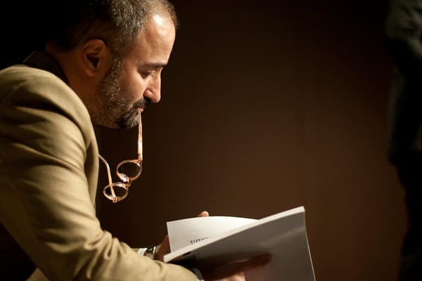
Obscurity and individuality is something that drew me to the idea of featuring the director of the film "Old Habits Die Hard" upon the magazine cover for the explicit reason that this is yet another tact that subverts the expected conventions of a magazine cover, generally people will not be expecting a director to appear on the cover of a magazine as normally they are expecting the main acting stars of the film to appear in promotional materials such as a magazine promotion. However, given that a convention of Social Realism is to use new acting talent and unfounded "stars", it would make little sense to promote a film on an actor who would be a complete unknown with relatively little experience and kudos under his belt. I felt that promoting the film through the use of the magazine with it's entire focus on Social Realism would be a suitable backdrop in which to promote the film, as existing fans of the genre, to whom our film is widely appealing to are able to become quickly informed of the new and exciting forthcoming release.


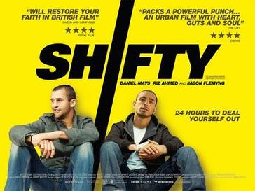
It was in straying away from the practised Codes and Conventions that I took the majority of my creative decisions regarding my own film poster. Like the film magazine, although Zach and I were working as a pair for the majority of the task, our Ancillary Tasks could share consistent themes such as font and lettering as well as ideas but ultimately they had to remain as original and individualised pieces of work. As inspiration for my poster, I looked at the example of existing Social Realism film "Shifty", where the poster is very much reminiscent of what I myself was hoping to create in that the poster is focussing on two characters and their personal journey. Indeed, this is very similar to the vision I had in mind for my own poster when creating it. Like the film Shifty my poster also focuses primarily on a character's journey, the contrast being however that in my own work, the character appears isolated and alone, symbolising that he has to take up the fight against his addiction alone, whereas in the poster for  Shifty it is clear that the two characters share some sort of connection in either friendship or familial bond and crucially their faces are already known to the audience, fitting a convention of the genre as the audience is already able to successfully identify with the main protagonists of the piece prior to seeing the film in full. I also tried to follow the systematic, logical layout of the Shifty film poster by having my film title in the middle of the poster and then being separated into quadrants.


  On my own poster, I chose to obscure the character's face from view so as to reinforce the idea that Toby's experiences that are documented within the film could happen to anyone and everyone. Similarly, another reason for choosing to obscure the characters face from view in my poster is the fact that Toby's identity remains concealed and hidden and furthermore will encourage more people to go and see the film upon release as they will want to uncover his true identity. Stylistically, I subverted the convention of attaching billing to my film poster as I feel that this would have detracted from the overall dark look of the piece had brightly coloured billing been included on the poster. I conformed to the convention of attaching quotations from press reviews and film critics from reputable publications such as British broadsheet Berliner style newspaper "The Guardian", a mainstream left wing publication supporting the "Indie" style of film that our film would ultimately fall into. Similarly, I also included a quotation from mainstream film magazine "Total Film"  to highlight the secondary mainstream audience we were aiming to target besides just fans of the Social Realism genre.
In conclusion, I feel that I have conformed to, as well as subverted, well established Codes and Conventions of the Social Realism genre to great effect across my three tasks to provide realistic products all of which I'm extremely proud to say that I have created.              

Tuesday, 24 March 2015

Finished Film Poster

Below is the Ancillary Task of my film poster. I used digital photo manipulation software Adobe Photoshop to create my film poster. I found the software quite challenging to use to begin with, given  the vast array of options available and complexities f applying all of the numerous effects and text. This all came as a big shock to me as a newcomer and a beginner such as I was when I first came to use the software for my own Ancillary Task. I was pleased however, with my final result and how I was effectively able to implement the use of colour systematically and effectively into my work.

I am particularly pleased with the separation I used in  the picture, dividing up the poster into three sections helped to a large extent by the metal railing upon which is seated our central protagonist . To the left hand corner of the poster features a metal grille/ shutter  upon which is written  a quote from a review by Total Film, calling our film "Exhilarating", followed by which is a 5 star review. In the middle (second) section of the poster on the brick wall is the title of our film Old Habits Die Hard written in an intentional font style to represent the work of supposed graffiti artists in the dilapidated area, acting as symbolism for the desperate economic and social situation   followed by a short excerpt from the film's dialogue.  In the right hand corner/ third of the poster is an excerpt from a film review of the Guardian, praising our film for it's "Gritty. Hard- hitting and brutal" nature.  I chose to separate my poster into sections of three to prove aesthetically pleasing to the eye. This was the inspiration behind the decision to have our central protagonist seated in the centre of the poster on the railings as he is the character around which our story focusses, it therefore makes sense to place the character as the centre of the audience's undivided attention and focus on the front of the poster.

I used dark lighting on the poster to create a sense of trepidation foreboding and danger, coupled to this was our central protagonists concealed identity. Indeed, a sense of danger was also incurred through the red text used  on the poster to create feelings of anxiety and danger for the viewer subtly informing them of the dark subject matter contained within the film.

Finished Film Magazine Cover

Below is my final film magazine cover that I have created as part of my Ancillary Tasks. I created a fictitious title called ArtHouse Indie promoitng the widely under reported genre of Social Realism. I am pleased with how the overall product looks and feels both as an individual piece but also how it appears to reflect and effectively complements the tone of my other two tasks of a film poster and film trailer. I believe that this has been able to be achieved through the implementation of consistent colours throughout the use of all three tasks such as the use of the green coloured text that is used effectively in all of the tasks. This was on account of the fact that the colour green is widely connoted as promoting health and wellbeing, as our film is a direct juxtaposition to positive health, as it is focussing on recreational drug use and the abuse that is subsequently caused by it.  This was done intentionally to create associated feelings within the audience of synonymity with our film when they see the colour green. Furthermore, this supports further my research into marketing consistencies of existing titles where I found that similarities between promotional materials led to the target demographic drawing connections to the film that the materials were promoting. This is a similar effect we were aiming to replicate within our own work.  I hope that the film magazine is effective in promoting the film product in conjunction with the film trailer and film poster. I provide a greater level of detail in exploring my creative decisions behind the text in Evaluation Activities 1 and 2.


Tuesday, 17 March 2015

Old Habits Die Hard Trailer A2 Film Trailer


I personally am very proud of the work and all that we have achieved in the making of this product along with my 2 ancillary tasks both of which I am also extremely proud. I hope the effort undertaken in all three tasks is evident in the viewing of the final products.
Enjoy!

Thursday, 26 February 2015

Final Script


After a combined effort by both Zach and myself we have colluded together to create a final draft of the script from which we can form the basis of beginning to film within the coming weeks.

Old Habits Die Hard

(Over the shoulder Mid to Close shot of protagonist (Toby) Made to look like He is Filming a Vlog)

Toby: Is this thing on?... (Sits back in chair, relaxing, but on edge) 

(Music Starts - Slow with fade in)
(Camera fades to black then re-enters on a track/Panning side on shot of Protagonist walking)
(Starts at waist then pans down to legs)
(Low Angle Camera shot of Protagonist's feet walking)
(Approaches door, Match on action opening door)

(Voice Over) Toby: I think it started when I was a kid, growing up around my deadbeat parents who would rather light up then go out. I promised my self that I would never be like them but I guess all the time I spent fighting it just ended with me falling harder.

(Music picks up pace and matches the cutting of the shots)
(Sequence of drug related imagery at fast continuous pace)
Toby:  Not for pleasure. (Echo in background)
Toby: I love the hits man, but only when they last. 
Toby: Just to survive. (Echo in background)
Toby: They get fewer and fewer every time.
Toby: Just to survive. (echo in background)
Toby: I need this, I crave it and I will do whatever it takes to get it.
Toby: To drag yourself out of a shithole and into the light of normality. (Echo in background)

(Music remains fast paced)
(Sequence of shot of over the shoulder shots of protagonist faced with danger)

(Music slows, shots speeds down)
(Over the shoulder Mid to Close shot of protagonist (Toby) Made to look like He is Filming a Vlog)
Toby: If you're like me then we I comes down to it remember this, to get what we need you have to get good mates who share your struggles.

Cut to scene of Marty and Toby
Marty: I thought you were done with this shit bro?
Toby: Yeah, well I was never one to keep my promises. I’m back in the game. 
(Voice Over) Toby: When you’ve been in the ‘game’ as long as I have you begin to realise when shit's going down. If you fail to notice it quick enough you could be fighting for your life or worse pride. Then one day you have to wake up to reality that you ain’t ever going to protect something till your out of the game for good.

Vincent: I believe you owe us something my friend 
Toby: A long time ago perhaps. Today both you and I know I don’t owe you shit.
Vincent: Time (Heavily exaggerated) doesn't change a damn thing Toby!

(Music explodes to life showing Protagonist from behind facing off against a group of people, then a group of people line up with protagonist, groups walk towards each other)
(Middle man points at Protagonist)
(Sequence of close ups of main characters)
(Over the shoulder Mid to Close shot of protagonist (Toby) Made to look like He is Filming a Vlog)
(Slow Panning shot to protagonists face)
Toby: My names Toby Scott and this isn't a story.... Its my life.
Release date flickers on to the screen from a street lamp.
Fade to black

Tuesday, 24 February 2015

Media Essay

For the following Media Essay I examined the trailer for Science Fiction/ Action Adventure hybrid movie spectacular Jupiter Ascending, to see how large, corporate Hollywood Media conglomerate studios such as Universal Studios market a film to appeal to it's target audience of male viewers, a similar target audience to that of our production; in the hope that, albeit on a smaller scale, we are able to emulate some of the measures used to befit our own smaller scale production.


“How is the trailer for the film Jupiter Ascending constructed to appeal to its target audience?”


http://enigmasmovies.com/uploads/images/jupiter_ascending_movie_poster_2.jpg


 As with many trailers, the trailer for “action adventure” film Jupiter Ascending is constructed to appeal to its target demographic in a multitude and a variety of ways with the ultimate aim of encouraging their targeted audience to go and see the new film upon its release and exhibition in cinemas.


  • The Genre of the film trailer Jupiter Ascending is presented to the audience overtly to the audience as belonging to the genre of Science Fiction. This becomes evidently clear to the audience due to the setting of the trailer being predominantly set in the deep regions of space. An element of Science fiction also becomes clearly apparent to the viewer due to the repeated use of advanced technology shown in the trailer to the viewer. It is these subtleties that inform the viewer almost instantaneous of the film trailer beginning as to what the genre of the film will be given the clear indicators shown through the fantastical setting of deep space.   
  •  The Narrative of the film trailer is one that is fast paced and full of action. Typically, the narrative presented to the viewer in the trailer is one that has been presented in many guises before in varying film titles. In Jupiter Ascending, this typical story has been replenished with different characters and a revitalised and regenerated surrounding to bring the story up to date for a modern age. The narrative of the film is a simple construct in that it follows the story of an unbeknownst individual who possesses a great deal of previously unknown power. Indeed, in the trailer the female protagonist is told that she “is entitled to the Earth” and that she only needs to claim it from the cruel and antagonistic character revealed only as Emperor Barmelow who intends to “harvest the Earth” before it is taken from him. She is aided by an attractive male bounty hunter who intends to see her take her rightful position in the hierarchal position of intergalactic politics. 
  • Pace The pace of the trailer is very energetic and fast paced and it is this fast pace that drives the narrative of the story forward in the trailer, as the trailer is somewhat relentless in its pace with a few hiatus moments in the trailer to provide the audience opportunity to catch their breath.
  • Target Audience The target audience of the trailer is orientated towards the male demographic as we see the female protagonist in distress and being saved by an attractive and good looking male protagonist to attract female members of the audience.
  • Voiceover: The trailer requires little use of a voiceover as the relevant audience information that conventionally would be expected to perhaps be found through a voiceover is presented to the audience as titles onto the viewing screen. Relevant information such as the producers and investors of the film project, in this instance Warner Bros. Pictures and Village Roadshow Pictures, are presented to the audience through the use of intertitles as well as the producers of the film project who in this case are credited as having been behind the hugely successful action and adventure film trilogy of the Matrix.
  • Credits and Intertitles In the absence of a voiceover being used in the trailer, it is the credits and intertitles dispersed throughout the trailer that convey to the audience the necessary and relevant information about the film that they require such as who produced the film and additionally who directed.  
  • Soundtrack and Music The music builds to a crescendo and tumultuous conclusion as the trailer steadily progresses to ramp up the tension and increase the intensity of the situations with which the characters are placed in to energise the audience to go and see the full feature film.
  • Shot Types/ Camera Angles. Perhaps in order to successfully and eloquently demonstrate the vast expanse of the setting of the film, it is largely wide angle shots that are used in the majority of the trailer as it is through this viewing angle that the audience are able to obtain the maximum scope and vision of the immersive world of the film.
  • Special effects: If there is one thing that the trailer is keen to showcase in it’s upmost above all other aspects of the trailer, then it is the special effects and the financial expenditure that has been invested into the project. Without Special Effects and the advancements in CGI computer technology the film would hold little attraction or serious contention to large media outlets and large  media conglomerate cinema chains, which would be looking to the trailer as a means of persuasion from the film studio to showcase the film in their cinema, with the aim to convince the cinema chain that the film will be a sound success financially and a money spinner for the cinema, a gamble worth investing in as the likelihood remains that it will pay off for both commercial parties and do well at the box office.  Perhaps more importantly, however, is the fact that as the film is classifying itself into the genre of Science Fiction with the setting holding a very futuristic feature and element to it instantly encapsulates the audience into the world of the film.
  • Unique Selling Point of the trailer The Unique Selling Point of this trailer is it’s unique ability to not only captivate the audience in it’s first instance with the exotic and vibrant fantastical locations of a future galactic age but to maintain the interest of audience members by providing a level of relate-ability to members of the target audience who, no doubt at some point during the trailer’s duration, are questioning their connectivity and relate-ability to the characters given the setting of the trailer and the daring situations from which the characters must escape from to ensure their continued survival. The point of most relate-ability for audience members in my eyes would, most probably, occur in the portion of the trailer where we see the attractive female protagonist, identified in the trailer as on an intergaltic scale possessing an extremely influential and powerful position in the hierarchy of foreign politics, participating in an arduous and mundane task of cleaning out the latrines. This moment in the trailer not only appeals to the audience in terms of being able to relate to the character’s situation but also provides humour for the audience as it is both unexpected and rather comical to see a character in a position of such unbeknownst power to be partaking in such a job devoid of vivacious nature and variety.  


To conclude, the trailer uses a variety of media film elements that aim to construct a viable and attainable profitmaking film for the producers of the project without compromising on the quality of the finished product.


Production Company


To maintain the suspension of disbelief for our audience and for our film trailer to seem as realistic and authentic as possible, Zach and I decided to create our own production company to make our trailer and the supposed complete production seem all the more realistic. As the film trailer which we are producing fits purportedly into the genre of Social Realism, we decided to reflect this fact in the name of our fabricated production company. We named our production company "Indi-Pendent Productions"; we chose to name our production company in this way as through the separation of the two units of the word independent through the use of a Haiphong and the intended, incorrect spelling of the first part of the word "Indi" emphasises the colloquialism of the genre of social realism as "Indi", films of the genre are often termed in this manner as through this labelling by film goers they are singled out and labelled as markedly different and unique. However, through the spelling of our production company name, we have chosen to emphasise the fact that the films this fictitious studio would back and subsequently produced are different and this is a fact we were keen to emphasise through the abnormal and markedly unique spelling of the word "Independent."      


We chose to illuminate our logo in a darkened shade of emerald green to connote to the audience the subject matter of the trailer prior to viewing it. We believed that the use of the colour green would systematically aid viewers in their depiction of upcoming events in the trailer and they would know that the subject matter of the trailer would be inclusive of the world of drugs and the dark consequences associated with partaking in their recreational use. We believed that the use of the colour green would symbolise drugs most potently as the connotations of health whilst suggesting health and wellbeing are in direct contrast to the subject matter of our trailer, depicting the other far more negative side associated with drugs in society which we were hoping to replicate in our finished trailer. The isolation of the green colour used on the font surrounded by an impenetrable black background made the logo and more importantly, the fictitious company stand out and become obvious and apparent to the viewer which was our main focus when creating the logo.


I believe if our production company did exist in real terms it would be similar in nature to existing studios such as Film4 and BBC Films, organisations that help fund small directors with their commercial short film ventures, most notably of the Social Realism genre. I am proud of the production company that we have created as I feel the logo is both simplistic, recognisable, bold and memorable, attributes that we are keen not just to be possessed by our production company logo but our film trailer production in general.